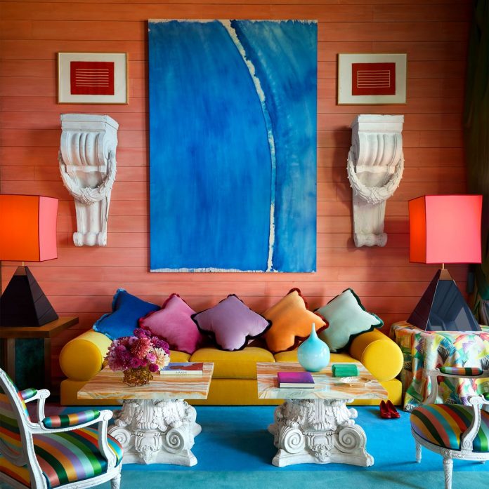
Each spring an invigorating palette of colors emerges from the latest presentations at fashion and design weeks. This season’s hottest hues feature a range of grounding earth tones, sunny accents, and playful brights, spotted everywhere from Milan Design Week to the Paris runways.
Spring 2024 has been all about bold self-expression and timeless comfort. Whether you lean toward the boldness of hot pink and radiant red or the comforting embrace of browns and greens, there’s a trend for every taste this season. Read on for key insights from top design experts.
Hot Pink
According to trend forecasting agency WSGN’s director of interiors, Gemma Riberti, the hot pink hue first ushered in by Barbiecore is still holding strong.
“Something surprising emerging from recent trade shows and latest launches is the presence of expressive brights,” Riberti notes. “The rise in global searches for ‘hot pink chair’ and ‘hot pink desk chair’ as a related query on Google Trends is an interesting example of how the appeal for high-octane colors is impacting interiors,” she continues.
And those Google searches are onto something: The best way to use bright pink is as an accent—be it a chair, cushion, or picture frame.
Radiant Red
Red is another standout bright this season. “It is coming up in solid color applications both in apparel and in interiors,” Riberti says. Coincidentally, the hue had a viral moment on TikTok earlier this year, with design devotees preaching the virtues of “unexpected red theory”—the idea that if you add a red element to any interior it will automatically improve the space. The theory, which sounds simple enough, sparked thousands of hot takes and can be distilled down to color theory. (A pop of red will complement colors opposite and next to the hue on the color wheel—green, orange, and violet.) TikTok theories aside, it’s a classic yet playful shade, ensuring it will remain relevant in many seasons to come.
Earthy Browns
According to experts, like Riberti, brown has taken center stage as a response to the current economic and political climate. “In times of uncertainty and upheaval, colors that are grounding, relatable, and dependable like greens and browns take the lead. Natural, nurturing, organic qualities become paramount to consumers, in apparel and in the home first and foremost,” she explains. Farrow & Ball’s color curator, Joa Studholme, agrees: “Browns feel earthy, warm and artisanal.”
While brown does connect us to nature, interior designers are also describing “quiet luxury brown” as the new neutral. “There’s been an evolution of how we work brown into contemporary interiors. We’ve seen an increased use of ‘brown furniture’ antiques, more millwork featuring natural wood tones, and even brown upholstery,” says interior designer Mandy Cheng. And paint companies are cashing in, with several new shades debuting this spring.
Butter Yellow
Interior designer and e-commerce empress Shea McGee introduces butter yellow as the season’s en vogue color, highlighting its optimistic charm. “I love how sunny and relaxed it is without going full force into lemon territory,” she says. This creamy, pale shade is being used in wallpaper, paint, and smaller accents like throw pillows and lamps, serving as a subtle yet effective mood booster. It’s an example of what Pinterest is dubbing “dopamine decor”—a search term that the platform has seen increase 280% heading into the summer.
Terra-cotta
Desert-inspired hues have also been popular of late, and terra-cotta is a spring standout. Why? “It provides a rich, earthy feel, popular in living rooms and outdoor spaces,” says interior designer Kate Marker. “Plus, it bridges indoor and outdoor aesthetics seamlessly.” Interior designer Rebekah Zaveloff agrees: “It’s reminiscent of a chic island resort on holiday,” she says. Incorporating terra-cotta hues through ceramics, soft fabrics, or painted walls can bring a glimmer of vacation bliss to every day.
Rich Greens
Finally, deep, rich greens (think emerald) are making waves. As noted by Riberti, green is similar to brown in that it is also a grounding color. But designers like that it has a bit more oomph. “Green feels like a sophisticated and discerning alternative to safer neutrals,” Zaveloff explains.
Studholme recommends Farrow & Ball’s Duck Green if you’re searching for a strong green. “It is unquestionably our smartest green, but feels strangely familiar like something from our childhoods while still retaining an element of sophistication,” she says.


